DATA VISUALIZATION
These are some small projects that demonstrate my beginner experiences with data visualization. Transferring dates from one form to another, the process is to make data more recognizable, easier to understand. Sometimes, it could also be meaningless, just for aesthetic purposes.
LOW POLY
/ from color to vector


FORCE
/ dynamic simulation

Visualize the force distribution of the beam with thickness and color effect. Bigger radius and and warmer color present greater force.
TRAJECTORY
/ dynamic simulation
First to randomly distribute the dot on this geographic model, and then use kangaroo (a component in grasshopper) as gravity simulation. It could also visualize the slope of the model by falling speed of the dots.

MANHATTAN
/ from height to color


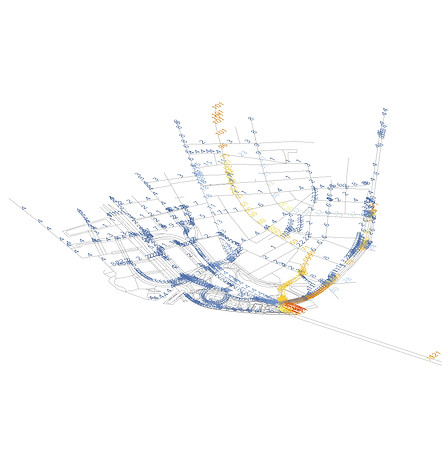
MAIN TRAFFIC
/ sorting data
This practice is to seek the most occupied road in Manhattan. Assuming people usually take the shortest path, by sorting out the shortest distance between two random intersection joints, the main traffic can be detected.

3 sort out most frequent path visualized by number & color
1 original path

4 sort out most frequent path visualized by height & color
2 sort out intersection joint


